Comments? Questions? Get Involved? Join the Forum
XML Form
There are two types of XML Form: single and list. A single form represents a single set of fields with a label and widget for each. A list form is presented as a table with a column for each field, the label in the table header, a widget for the field in each row, and a row for each entry in the list the form output is based on.
While there are other ways to get data, most commonly a single form gets field values from a Map and a list form from a List of Maps.
A XML Form is like a XML Screen in that they are both rendered using a FTL macro for each element, and both support multiple render modes. Just like with XML Screen widgets you can add your own widgets by adding macros for them. The XML Form macros go in the same FTL file as the XML Screen macros, so use the same approach to add custom macros.
Form Field
The main element in a form is the field, identified by its name attribute. When a form extends another form fields are overridden by using the same field name. For HTML output this is also the name of the HTML form field. The name is also used as the map key or parameter name (if no map key value found, or when there is an error submitting the form) to get the field value from. To get the field value from somewhere else in the context, and still use the name for the parameter when applicable, use the entry-name attribute which can be any Groovy expression that evaluates to the value desired.
For automatic client-side validation in generated HTML based on a service parameter you can use the validate-service and validate-parameter attributes on the field element. When the form field is automatically defined based on a service using the auto-fields-service element these two attributes will be populated automatically. The XML Form renderer will also look at the transition the form submits to and if it has a single service-call element (as opposed to processing input using an actions element) it will look for a service input parameter with a name matching the field name and use its validations.
The field type or "widget" (visual/interactive element) of a field goes under a subelement of the field element. The default widget to use goes under the default-field subelement and all fields should have one (and only one). If you want different widgets to be used in specific conditions use the conditional-field element with a Groovy expression that evaluates to a boolean in the condition attribute. This works for both single and list forms, and for list forms is evaluated for each row.
There is also a field.header-field subelement for a widget that goes in the header row of list forms. When used these header field widgets are part of a separate form that is meant to be used for search options. Sort/order links naturally go along with search options in the list form header and these can be turned on by setting the header-field.show-order-by attribute to true or case-insensitive.
A field’s title comes from the default-field.title attribute unless there is a header-field element, then it comes from the title attribute on that element. The default-field element also has a tooltip attribute which shows as a popup tooltip when focused on or hovering over the field (specific behavior depends on the HTML generated or other specific form rendering).
It is often nice when date values are red when a from date has not been reached or after a thru date. This is controlled using the default-field.red-when attribute, which by default is by-name meaning if the field name is fromDate then the field is red when the date is in the future and if the field name is thruDate then the field is red when the date is in the past. The red-when attribute can also be before-now, after-now, and never.
Field Widgets
There are a number of OOTB widgets for form fields, and additional widgets can be added using the extension mechanism described for screens in the Macro Templates and Custom Elements section.
Any of the widgets usable in screens can be used in XML Form fields (see the XML Screen Widgets section). There are also various widgets that are specific to form fields. Here is a summary of the OOTB field widgets in Moqui:
| auto-widget-service | Define the field widget automatically based on the parameter-name input parameter of the service-name service. Use the field-type attribute to specify the general type of field widget to use, the specific field widget is selected based on the parameter object type. This can be edit (default), find, display, find-display (adds both find and display widgets), or hidden. |
| auto-widget-entity | Define the field widget automatically based on the field-name field of the entity-name entity. Use the field-type attribute to specify the general type of field widget to use, the specific field widget is selected based on the field type. This can be edit, find, display, find-display (default; adds both find and display widgets), or hidden. |
| widget-template-include | Form field widget templates are defined in a XML file with the widget-templates root element. Each widget-template element can contain any of the field widget elements with ${} parameters as needed. To use a widget template just specify its location and set subelements as needed define fields for just the scope of rendering the template. |
| check | Show check boxes for a list of options from the entity-options,* list-options*, and/or option subelements (see the drop-down description for details). Optionally specify a box to check by default using the no-current-selected-key attribute, or check all boxes by setting all-checked to true. |
| date-find | Displays two date/time input widgets just like date-time with the same type and format attributes. Use the default-value-from attribute for the default value of the from (left) input box, and the default-value-thru attribute for the thru (right) one. |
| date-time | A date/time input widget specific to the type, either timestamp, date-time, date, or time. The format of the date/time string is specified in the format attribute using a Java SimpleDateFormat string. The text input box part of the widget is size characters wide on a single line allowing at most maxlength entered characters, though these are optional and automatically set based on the type. Use the default-value attribute to specify a value to use if there is no context or parameter value for the field. |
| display | A plain text display of the expanded string from the text attribute (or the field value if empty) plus a corresponding hidden field submitted with the form unless also-hidden is set to false. Use the format attribute to specify the Java format string for date/time (SimpleDateFormat), number (DecimalFormat), etc values. For currency formatting specify the field containing the currency Uom.uomId in currency-unit-field. For HTML output by default encodes the text unless encode is set to false. |
| display-entity | Lookup an entity value for entity-name and display the expanded text string including the entity field values. This is limited to lookup by a single primary key field, and if the entity’s PK field has a name different from field.name then specify it with the key-field-name attribute. By default this is a cached query, to not use the entity cache set use-cache to false. Just like display, this has a corresponding hidden field submitted with the form unless also-hidden is set to false. For HTML output by default encodes the text unless encode is set to false. |
| drop-down | A drop-down, or multi-line box if size is set to a number greater than 1. To allow selection of multiple values set allow-multiple to true. The currently selected value can be the first in the drop-down with a divider from the rest of the options if current is set to first-in-list (default) or can be selected from the options with selected. Set allow-empty to true to add an empty option to the list. The list of options is assembled using the entity-options, list-options, and/or option subelements, or alternatively the dynamic-options element to get the options with a request to a screen transition. Use entity-options to get options from database records. Specify the entity field to use as the key/value with the key attribute, and the field to use as the label text with the text attribute. The query constraints and options are specified using the entity-find element, the same element used in XML Actions scripts. For options from a List of Maps use the list-options element with a Groovy expression that evaluates to the List in the list attribute, and the Map key for the key/value of the option in the key attribute and the label text Map key in the text attribute. To specify individual options explicitly use an option element with key and text attributes for each option. For dynamic-options specify the screen transition that returns a JSON string containing a List of Maps plus value-field and label-field attributes for the map keys to get the value and label from in each Map. The main reason to use dynamic options is to change the options when another field changes. To do this use one or more depends-on subelement with the form field name in its field attribute. When a referenced field changes new options will be requested from the screen transition, passing all referenced field values as parameters to the request. Set the default option with its key in the no-current-selected-key attribute. If that option is not in the existing options specify its description using the current-description attribute. By default uses a dynamic drop-down widget that filters options based entered text. To use a plain drop-down set search to false. To allow the user to enter a new option to submit that is not already in the drop-down set combo-box to true. |
| file | A file upload input box (has a button/link for a file selection popup window) size (default 30) characters wide allowing at most maxlength entered characters. Use the default-value attribute to specify a value to use if there is no context or parameter value for the field. |
| hidden | A hidden field whose value is passed with the submitted form but nothing is displayed to the user. Use the default-value attribute to specify a value to use if there is no context or parameter value for the field. |
| ignored | Treats the field as if it was not even defined. Useful when extending another form to eliminate undesired fields. |
| password | A password input box size (default 30) characters wide allowing at most maxlength entered characters. Masks the input for security. |
| radio | Show radio buttons for a list of options from the entity-options, list-options, and/or option subelements (see the drop-down description for details). Optionally specify the default option’s key using the no-current-selected-key attribute (used if there is no value or parameter for the field). |
| range-find | Mainly for numeric range find, displays two small input boxes size (default 10) characters wide allowing at most maxlength entered characters in each. Use the default-value-from attribute for the default value of the from (left) input box, and the default-value-thru attribute for the thru (right) one. |
| reset | A button to reset the form. The button text comes from the field title. |
| submit | A form submit button. The button text comes from the field title unless the image subelement is used to put an image on the button. An icon next to the text can be used with the icon attribute set to an icon style from the icon library (for the default runtime webroot the Glyphicons for Bootstrap icons are available, for example icon="glyphicon glyphicon-plus" or the Font Awesome icons can be used with something like "fa fa-search"). To show a message and ask the user to confirm when the button is pressed put the message in the confirmation attribute. |
| text-line | A simple text input box size characters wide on a single line allowing at most maxlength entered characters. Use the default-value attribute to specify a value to use if there is no context or parameter value for the field. Set disabled to true to make the input box display only, not allow a change to the value. Use the format attribute to specify the Java format string for date/time (SimpleDateFormat), number (DecimalFormat), etc values. A text-line can have autocomplete by implementing a screen transition to provide the values and specifying the transition name in the ac-transition attribute. The transition should respond with a JSON string (using ec.web.sendJsonResponse()) with a List of Maps with value and label fields. Optionally specify the time delay in milliseconds (default 300) with ac-delay and the minimum characters to enter before lookup with ac-min-length (default 1). |
| text-find | Like text-line with size, maxlength, and default-value attributes and also has a checkbox for ignore-case (defaults to true, i.e. checked), and a drop-down for a search operator with a default specified in the default-operator attribute (can be equals, like, contains, or empty). The ignore case checkbox and operator drop-down can also be hidden (defaults passed as hidden parameters, no visible UI widget) using the hide-options attribute Options for hide are false (default, show both), true (hide both), ignore-case (hide only ignore case checkbox), and operator (hide the operator drop-down). |
Single Form
Use the form-single element to define a single form. These are the attributes of the form-single element:
- name: The name of the form. Used to reference the form along with the XML Screen file location. For HTML output this is the form name and id, and for other output may also be used to identify the part of the output corresponding to the form.
- extends: The location and name separated by a hash/pound sign (#) of the form to extend. If there is no location it is treated as a form name in the current screen.
- transition: The transition in the current screen to submit the form to.
- map: The Map to get field values from. Is often a EntityValue object or a Map with data pulled from various places to populate in the form. Map keys are matched against field names. This is ignored if the field.entry-name attribute is used, that is evaluated against the context in place at the time each field is rendered. Defaults to fieldValues.
- focus-field: The name of the field to focus on when the form is rendered.
- skip-start: Skip the starting rendered elements of the form. When used after a form with skip-end=true this will effectively combine the forms into one.
- skip-end: Skip the ending rendered elements of the form. Use this to leave a form open so that additional forms can be combined with it.
- dynamic: If true this form will be considered dynamic and the internal definition will be built up each time it is used instead of only when first referred to. This is necessary when auto-fields-* elements have ${} string expansion for service or entity names.
- background-submit: Submit the form in the background without reloading the screen.
- background-reload-id: After the form is submitted in the background reload the dynamic-container with this id.
- background-message: After the form is submitted in the background show this message in a dialog.
To layout fields in a way other than a plain list of fields use the form-single.field-layout element. For HTML output there is an optional id attribute to facilitate styling. If the field layout contains field groups set the collapsible attribute to true to use an accordion widget to save space, optionally specifying the active group index instead of the first to be initially open. Here are the subelements to define a layout:
- field-ref: specifies where to include a field by name
- fields-not-referenced: include all fields not referenced elsewhere; if this element is not present fields that are not referenced in the field-layout will not be rendered
- field-row: create a row of fields specified by field-ref subelements; if there are two fields in the row they display in four columns, both with titles; if there are more than two fields only the title of the first field is displayed and the remaining field widgets go side-by-side in the row, wrapping if needed
- field-group: create a group of fields, in an accordion if field-layout.collapsible is true, with an optional title above the group and for HTML output an optional style for the container (div) around the group; use the field-ref, fields-not-referenced, and field-row subelements to specify the fields to include, and optionally put them in rows
Single Form Example
To get a better idea of the utility of different aspects of a single form let’s look at a more complex example. This form is the Edit Task screen from the HiveMind Project Manager application.
This form has examples of the following (see the full source below):
- Project: a drop-down populated using entity-options, and a separate link to go to the current project associated with the task
- Milestone and Parent Task: drop-down fields populated with dynamic-options, both dependent on the project (rootWorkEffortId) using the depends-on element
- Task Name: simple text-line input box
- Resolution and Purpose: standard Enumeration drop-down fields using the widget-template-include element with set subelements; Purpose uses a widget template constrained by a parent Enumeration (parentEnumId), whereas Resolution includes all values for an EnumerationType (enumTypeId)
- Status: standard status drop-down with options based on transitions from the current status using the StatusFlowTransition entity
- Due Date: simple date-time of type date input box
- Estimated Hours and Remaining Hours: simple number input boxes
- Actual Hours: display with a number format string
- Description: simple text-area
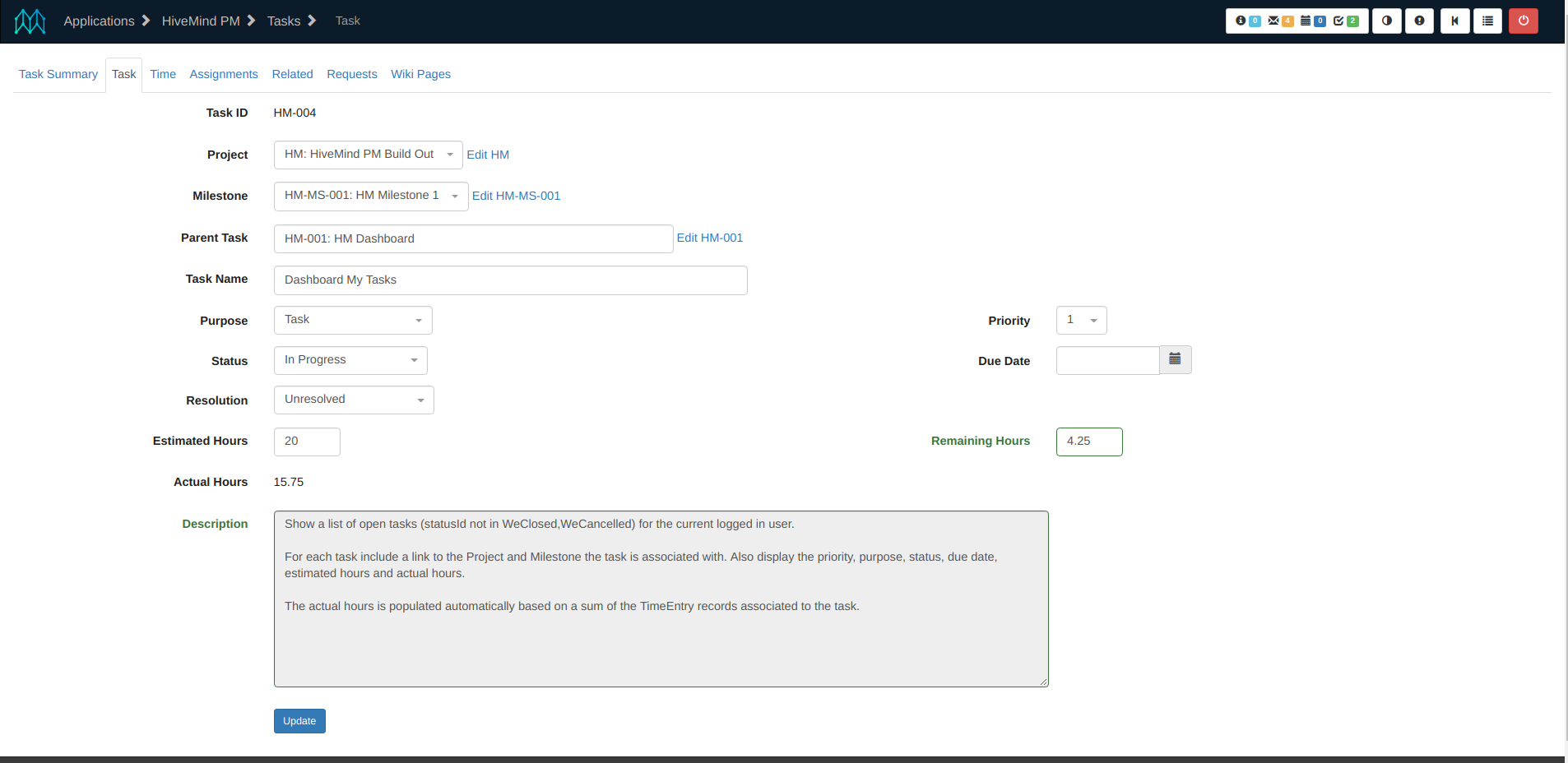
This form uses *field-layout* to put various fields side-by-side, but otherwise uses the default layout. For an example of a layout with a *field-group* accordion see the Edit Example screen in the Moqui Example app. Here is the source for the Single Form, and the XML Screen it is part of for context and to see the *transition* definitions, screen *actions* for data preparation, etc:
<screen xmlns:xsi="http://www.w3.org/2001/XMLSchema-instance"
  xsi:noNamespaceSchemaLocation="http://moqui.org/xsd/xml-screen-1.4.xsd"
  default-menu-title="Task" default-menu-index="1">
  <parameter name="workEffortId"/>
  <transition name="updateTask">
    <service-call name="mantle.work.TaskServices.update#Task"
      in-map="context"/>
    <default-response url="."/>
  </transition>
  <transition name="editProject">
    <default-response url="../../Project/EditProject"/>
  </transition>
  <transition name="milestoneSummary">
    <default-response url="../../Project/MilestoneSummary"/>
  </transition>
  <transition name="getProjectMilestones">
    <actions>
      <service-call in-map="context" out-map="context"
        name="mantle.work.ProjectServices.get#ProjectMilestones"/>
      <script>ec.web.sendJsonResponse(resultList)</script>
    </actions>
    <default-response type="none"/>
  </transition>
  <transition name="getProjectTasks">
    <actions>
      <service-call in-map="context" out-map="context"
        name="mantle.work.ProjectServices.get#ProjectTasks"/>
      <script>ec.web.sendJsonResponse(resultList)</script>
    </actions>
    <default-response type="none"/>
  </transition>
  <actions>
    <entity-find-one entity-name="mantle.work.effort.WorkEffort"
      value-field="task"/>
    <entity-find-one entity-name="mantle.work.effort.WorkEffort"
      value-field="project">
      <field-map field-name="workEffortId" from="task.rootWorkEffortId"/>
    </entity-find-one>
    <entity-find entity-name="mantle.work.effort.WorkEffortAssoc"
      list="milestoneAssocList">
      <date-filter/>
      <econdition field-name="toWorkEffortId" from="task.workEffortId"/>
      <econdition field-name="workEffortAssocTypeEnumId"
        value="WeatMilestone"/>
    </entity-find>
    <set field="milestoneAssoc" from="milestoneAssocList?.getAt(0)"/>
    <set field="statusFlowId"
      from="(task.statusFlowId ?: project.statusFlowId) ?: 'Default'"/>
  </actions>
  <widgets>
    <form-single name="EditTask" transition="updateTask" map="task">
      <field name="workEffortId">
        <default-field title="Task ID">
          <display/>
        </default-field>
      </field>
      <field name="rootWorkEffortId">
        <default-field title="Project">
          <drop-down>
            <entity-options key="${workEffortId}"
              text="${workEffortId}: ${workEffortName}">
              <entity-find entity-name="WorkEffortAndParty">
                <date-filter/>
                <econdition field-name="partyId"
                  from="ec.user.userAccount.partyId"/>
                <econdition field-name="workEffortTypeEnumId"
                  value="WetProject"/>
              </entity-find>
            </entity-options>
          </drop-down>
          <link text="Edit ${project.workEffortName} [${task.rootWorkEffortId}]"
            url="editProject">
          <parameter name="workEffortId" from="task.rootWorkEffortId"/>
          </link>
        </default-field>
      </field>
      <field name="milestoneWorkEffortId"
        entry-name="milestoneAssoc?.workEffortId">
        <default-field title="Milestone">
          <drop-down combo-box="true">
            <dynamic-options transition="getProjectMilestones"
              value-field="workEffortId" label-field="milestoneLabel">
              <depends-on field="rootWorkEffortId"/>
            </dynamic-options>
          </drop-down>
          <link url="milestoneSummary"
            text="${milestoneAssoc ? 'Edit ' + milestoneAssoc.workEffortId : ''}">
          <parameter name="milestoneWorkEffortId"
            from="milestoneAssoc?.workEffortId"/>
          </link>
        </default-field>
      </field>
      <field name="parentWorkEffortId">
        <default-field title="Parent Task">
          <drop-down combo-box="true">
            <dynamic-options transition="getProjectTasks"
              value-field="workEffortId" label-field="taskLabel">
              <depends-on field="rootWorkEffortId"/>
            </dynamic-options>
          </drop-down>
        </default-field>
      </field>
      <field name="workEffortName">
        <default-field title="Task Name">
          <text-line/>
        </default-field>
      </field>
      <field name="priority">
        <default-field>
          <widget-template-include location="component://HiveMind/template/
            screen/ProjectWidgetTemplates.xml#priority"/>
        </default-field>
      </field>
      <field name="purposeEnumId">
        <default-field title="Purpose">
          <widget-template-include location="component://webroot/template/
            screen/BasicWidgetTemplates.xml#enumWithParentDropDown">
            <set field="enumTypeId" value="WorkEffortPurpose"/>
            <set field="parentEnumId" value="WetTask"/>
          </widget-template-include>
        </default-field>
      </field>
      <field name="statusId">
        <default-field title="Status">
          <widget-template-include location="component://webroot/template/screen/BasicWidgetTemplates.xml#statusTransitionWithFlowDropDown">
            <set field="currentDescription"
              from="task?.'WorkEffort#moqui.basic.StatusItem'?.description"/>
            <set field="statusId" from="task.statusId"/>
          </widget-template-include>
        </default-field>
      </field>
      <field name="resolutionEnumId">
        <default-field title="Resolution">
          <widget-template-include location="component://webroot/template/
            screen/BasicWidgetTemplates.xml#enumDropDown">
            <set field="enumTypeId" value="WorkEffortResolution"/>
          </widget-template-include>
        </default-field>
      </field>
      <field name="estimatedCompletionDate">
        <default-field title="Due Date">
          <date-time type="date" format="yyyy-MM-dd"/>
        </default-field>
      </field>
      <field name="estimatedWorkTime">
        <default-field title="Estimated Hours">
          <text-line size="5"/>
        </default-field>
      </field>
      <field name="remainingWorkTime">
        <default-field title="Remaining Hours">
          <text-line size="5"/>
        </default-field>
      </field>
      <field name="actualWorkTime">
        <default-field title="Actual Hours">
          <display format="#.00"/>
        </default-field>
      </field>
      <field name="description">
        <default-field title="Description">
          <text-area rows="20" cols="100"/>
        </default-field>
      </field>
      <field name="submitButton">
        <default-field title="Update">
          <submit/>
        </default-field>
      </field>
      <field-layout>
        <fields-not-referenced/>
        <field-row>
          <field-ref name="purposeEnumId"/>
          <field-ref name="priority"/>
        </field-row>
        <field-row>
          <field-ref name="statusId"/>
          <field-ref name="estimatedCompletionDate"/>
        </field-row>
        <field-row>
          <field-ref name="estimatedWorkTime"/>
          <field-ref name="remainingWorkTime"/>
        </field-row>
        <field-ref name="actualWorkTime"/>
        <field-ref name="description"/>
        <field-ref name="submitButton"/>
      </field-layout>
    </form-single>
  </widgets>
</screen>
List Form
Use the form-list element to define a single form. These are the attributes of the form-list element:
- name: The name of the form. Used to reference the form along with the XML Screen file location. For HTML output this is the form name and id, and for other output may also be used to identify the part of the output corresponding to the form.
- extends: The location and name separated by a hash/pound sign (#) of the form to extend. If there is no location it is treated as a form name in the current screen.
- transition: The transition in the current screen to submit the form to.
- multi: Make the form a multi-submit form where all rows on a page are submitted together in a single request with a "_${rowNumber}" suffix on each field. Also passes a _isMulti=true parameter so the Service Facade knows to run the service (a single service-call in a transition) for each row. Defaults to true, so set to false to disable this behavior and have a separate form (submitted separately) for each row.
- list: An expression that evaluates to a list to iterate over.
- list-entry: If specified each list entry will be put in the context with this name, otherwise the list entry must be a Map and the entries in the map will be put into the context for each row.
- paginate: Indicate if this form should paginate or not. Defaults to true.
- paginate-always-show: Always show the pagination control with count of rows, even when there is only one page? Defaults to true.
- skip-start: Skip the starting rendered elements of the form. When used after a form with skip-end=true this will effectively combine the forms into one.
- skip-end: Skip the ending rendered elements of the form. Use this to leave a form open so that additional forms can be combined with it.
- skip-form: Make the output a plain table, not submittable (in HTML don't generate form elements). Useful for view-only list forms to minimize output.
- dynamic: If true this form will be considered dynamic and the internal definition will be built up each time it is used instead of only when first referred to. This is necessary when auto-fields-* elements have ${} string expansion for service or entity names.
Similar to field-layout in a single form there is a form-list-column element for list forms. When used there needs to be one element for each column in the list form table, and all fields must be referenced in a column or they will not be rendered. The form-list-column element has a single subelement, the same field-ref element that is used in the single form field-layout.
Data preparation for a form is best done in the actions in the XML Screen it is used in but sometimes you need to prepare data for each row in a list form. This can be done by preparing in advance a List of Map objects that have entries for each list form field. With this approach the logic that prepares the List can do additional data lookups or calculations to prepare the data. The other approach is to put XML Actions under the form-list.row-actions element. These actions will be run for each row in an isolated context so that any context fields defined will be used only for that row.
List Form View/Export Example
There are two main categories of list forms: those used for searching, viewing, and exporting and those used for editing a number of records in a single screen.
The Artifact Summary screens in the Moqui Tools application is a good example of a screen that is used for searching, viewing data, and exporting results to CSV, XML, and PDF files all using the same screen and form definition. The list form on the screen shows a row for each artifact with a summary of the moqui.server.ArtifactHitBin records for that artifact using the moqui.server.ArtifactHitReport view-entity.
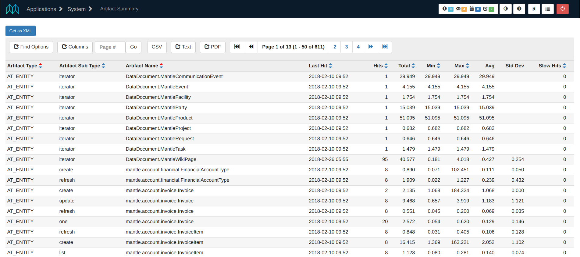
Note the "Get as CSV" link in the upper-left corner (and the similar XML and PDF links). This link goes to the simple ArtifactHitSummaryStats.csv transition that goes to the same screen and adds renderMode=csv, pageNoLimit=true, and lastStandalone=true parameters so that the screen renders with csv output instead of html, pagination is disabled (all results are output), and only the last screen is rendered (skipping all parent screens to avoid decoration, i.e. the last screen is "standalone"). See the XML, CSV and Plain Text Handling section for more detail.
Below the "Get as" links are the pagination controls which are enabled by default and by default shown when there is more than one page of results to display. In the form header row are the column titles and "+-" links for sorting the results in each column, plus a header find form with a drop-down for the Artifact Type and a text-find box for Artifact Name. These are all defined in the header-field elements under each field.
This form uses form-list.row-actions element to calculate the averageTime for each row, which is then displayed using a form field.
Here is the source for the ArtifactHitSummary.xml screen showing the details for the summary above:
<screen xmlns:xsi="http://www.w3.org/2001/XMLSchema-instance"
  xsi:noNamespaceSchemaLocation="http://moqui.org/xsd/xml-screen-1.4.xsd"
  default-menu-title="Artifact Summary">
  <transition name="ArtifactHitSummaryStats.csv">
    <default-response url=".">
      <parameter name="renderMode" value="csv"/>
      <parameter name="pageNoLimit" value="true"/>
      <parameter name="lastStandalone" value="true"/>
    </default-response>
  </transition>
  <transition name="ArtifactHitSummaryStats.xml">
    <default-response url=".">
      <parameter name="renderMode" value="xml"/>
      <parameter name="pageNoLimit" value="true"/>
      <parameter name="lastStandalone" value="true"/>
    </default-response>
  </transition>
  <transition name="ArtifactHitSummaryStats.pdf">
    <default-response url-type="plain"
      url="${ec.web.getWebappRootUrl(false, null)}/fop/apps/tools/System/
      ArtifactHitSummary">
      <parameter name="renderMode" value="xsl-fo"/>
      <parameter name="pageNoLimit" value="true"/>
    </default-response>
  </transition>
  <actions>
    <entity-find entity-name="moqui.server.ArtifactHitReport"
      list="artifactHitReportList" limit="50">
      <search-form-inputs default-order-by="artifactType,artifactName"/>
    </entity-find>
  </actions>
  <widgets>
    <container>
      <link url="ArtifactHitSummaryStats.csv" text="Get as CSV"
        target-window="_blank" expand-transition-url="false"/>
      <link url="ArtifactHitSummaryStats.xml" text="Get as XML"
        target-window="_blank" expand-transition-url="false"/>
      <link url="ArtifactHitSummaryStats.pdf" text="Get as PDF"
        target-window="_blank"/>
    </container>
    <form-list name="ArtifactHitSummaryList" list="artifactHitReportList">
      <row-actions>
        <set field="averageTime" from="(totalTimeMillis/hitCount as
          BigDecimal).setScale(0,BigDecimal.ROUND_UP)"/>
      </row-actions>
      <field name="artifactType">
        <header-field show-order-by="true">
          <drop-down allow-empty="true">
            <option key="screen"/>
            <option key="screen-content"/>
            <option key="transition"/>
            <option key="service"/>
            <option key="entity"/>
          </drop-down>
        </header-field>
        <default-field><display also-hidden="false"/></default-field>
      </field>
      <field name="artifactName">
        <header-field show-order-by="true">
          <text-find hide-options="true" size="20"/>
        </header-field>
        <default-field>
          <display text="${artifactName}"
            also-hidden="false"/>
        </default-field>
      </field>
      <field name="lastHitDateTime">
        <header-field title="Last Hit" show-order-by="true"/>
        <default-field>
          <display also-hidden="false"/>
        </default-field>
      </field>
      <field name="hitCount">
        <header-field title="Hits" show-order-by="true"/>
        <default-field>
          <display also-hidden="false"/>
        </default-field>
      </field>
      <field name="minTimeMillis">
        <header-field title="Min" show-order-by="true"/>
        <default-field>
          <display also-hidden="false"/>
        </default-field>
      </field>
      <field name="averageTime">
        <default-field title="Avg">
          <display also-hidden="false"/>
        </default-field>
      </field>
      <field name="maxTimeMillis">
        <header-field title="Max" show-order-by="true"/>
        <default-field>
          <display also-hidden="false"/>
        </default-field>
      </field>
      <field name="find">
        <header-field title="Find">
          <submit/>
        </header-field>
      </field>
    </form-list>
  </widgets>
</screen>
List Form Edit Example
The Entity Fields Localization screen in the Moqui Tools application is a good example of a list form used to update multiple records in a single page. This screen is designed for adding, editing, and deleting moqui.basic.LocalizedEntityField records that specify localized text to use instead of an entity record field’s actual value.
In the screenshot below there is a button in the upper-left corner to add a new record in a container-dialog modal popup. Just below that are the pagination controls which are enabled by default. The header row in the form has the field titles (in this case all generated based on the field name since there are no header-field.title attributes), the "+-" sorting links (with header-field.show-order-by=true), and header widgets for the fields to find only matching records.
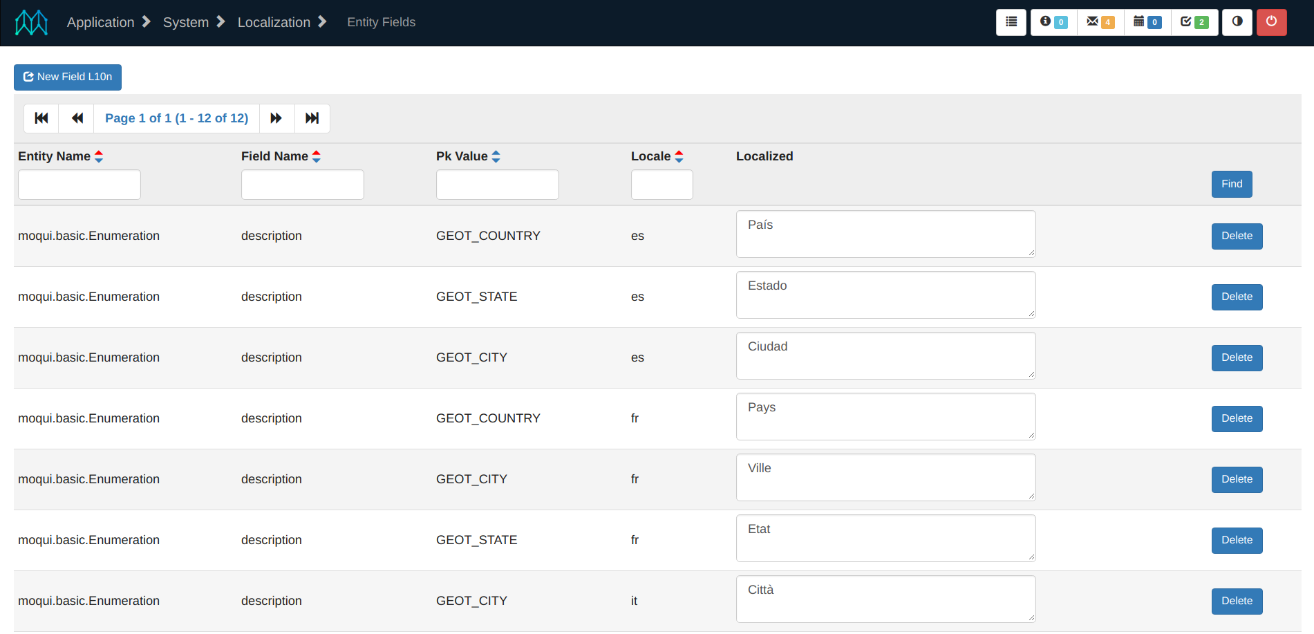
The body rows of the list form table have one row for each record with a Delete button, but the Update button is at the bottom and updates all rows in a single form submission to update a number of Localized values at once. Notice that the Find button in the header row is in the same column as the Delete button on each body row. To do this in the form definition the Find button is defined in a subelement of the header-field element for the delete field.
Below is the source for the EntityFields.xml screen. The create, update, and delete transitions use implicitly defined entity-auto services so there is no service definition or implementation for them. This functionality relies on only a XML Screen file and the definition of the LocalizedEntityField entity.
<screen xmlns:xsi="http://www.w3.org/2001/XMLSchema-instance"
  xsi:noNamespaceSchemaLocation="http://moqui.org/xsd/xml-screen-1.4.xsd"
  default-menu-title="Entity Fields" default-menu-index="2">
  <transition name="createLocalizedEntityField">
    <service-call name="create#moqui.basic.LocalizedEntityField"/>
    <default-response url="."/>
  </transition>
  <transition name="updateLocalizedEntityField">
    <service-call name="update#moqui.basic.LocalizedEntityField"
      multi="true"/>
    <default-response url="."/>
  </transition>
  <transition name="deleteLocalizedEntityField">
    <service-call name="delete#moqui.basic.LocalizedEntityField"/>
    <default-response url="."/>
  </transition>
  <actions>
    <entity-find entity-name="moqui.basic.LocalizedEntityField"
      list="localizedEntityFieldList" offset="0" limit="50">
      <search-form-inputs default-order-by="entityName,fieldName,locale"/>
    </entity-find>
  </actions>
  <widgets>
    <container>
      <container-dialog id="CreateEntityFieldDialog"
        button-text="New Field L10n">
        <form-single name="CreateLocalizedEntityField"
          transition="createLocalizedEntityField">
          <field name="entityName">
            <default-field>
              <text-line size="15"/>
            </default-field>
          </field>
          <field name="fieldName">
            <default-field>
              <text-line size="15"/>
            </default-field>
          </field>
          <field name="pkValue">
            <default-field>
              <text-line size="20"/>
            </default-field>
          </field>
          <field name="locale">
            <default-field>
              <text-line size="5"/>
            </default-field>
          </field>
          <field name="localized">
            <default-field>
              <text-area rows="5" cols="60"/>
            </default-field>
          </field>
          <field name="submitButton">
            <default-field title="Create">
              <submit/>
            </default-field>
          </field>
        </form-single>
      </container-dialog>
    </container>
    <form-list name="UpdateLocalizedEntityFields"
      list="localizedEntityFieldList"
      transition="updateLocalizedEntityField" multi="true">
      <field name="entityName">
        <header-field show-order-by="true">
          <text-find hide-options="true" size="12"/>
        </header-field>
        <default-field>
          <display/>
        </default-field>
      </field>
      <field name="fieldName">
        <header-field show-order-by="true">
          <text-find hide-options="true" size="12"/>
        </header-field>
        <default-field>
          <display/>
        </default-field>
      </field>
      <field name="pkValue">
        <header-field show-order-by="true">
          <text-find hide-options="true" size="12"/>
        </header-field>
        <default-field>
          <display/>
        </default-field>
      </field>
      <field name="locale">
        <header-field show-order-by="true">
          <text-find hide-options="true" size="4"/>
        </header-field>
        <default-field>
          <display/>
        </default-field>
      </field>
      <field name="localized">
        <default-field>
          <text-area rows="2" cols="35"/>
        </default-field>
      </field>
      <field name="update">
        <default-field title="Update">
          <submit/>
        </default-field>
      </field>
      <field name="delete">
        <header-field title="Find">
          <submit/>
        </header-field>
        <default-field>
          <link text="Delete" url="deleteLocalizedEntityField">
          <parameter name="entityName"/>
          <parameter name="fieldName"/>
          <parameter name="locale"/>
          </link>
        </default-field>
      </field>
    </form-list>
  </widgets>
</screen>